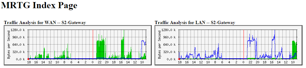
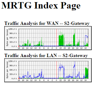
I often view big-picture MRTG graphs on a mobile device of some type, and I hate how the pages look… So I made some real quick drop in CSS changes to make the page a little responsive so it shows the graphs a little better. The pages are way beyond simple, but they work for me…
Here is what I did… Simply add the following code to the <head> </head> section of your index.html page.
<meta
	name="viewport"
	content="width=device-width, initial-scale=1.0, minimum-scale=1.0, maximum-scale=1.0, user-scalable=no" />

<style type="text/css">
@media all and (max-width: 1034px) {
	table { width: 100%; }
	img { width: 100%; max-width: 100%; height: auto; }
}

@media all and (max-width: 960px) {
	td { display: block; margin-bottom: 10px; width: auto; }
}
</style>
After that, when viewing the page on a smaller screen device, it will look a lot cleaner and the charts will scale correctly. I did remove the zoom functionality, but you can enable that by changing the maximum-scale and user-scalable options in the viewport meta tag.
Have you made any style changes to your MRTG pages? Do you have another tool that you prefer over MRTG?